Similar e-commerce analysis
Having looked into 2 e-commerce websites helped figure out some of the features that I could include in my e-commerce.
The homepage:
The homepage is one of the most important pages on the website since it is the first page that appears to the visitors. Thus, I tried to gather some ideas from similar websites to the one I am working on.
The first website is Chocolate dino company:
Homepage :
 |
| The header part (Chocolate dino company) |
 |
| The body and the footer (Chocolate dino company) |
 |
| The product page (Chocolate dino company) |
As seen, the product page has all of the essential information about the product, a high-resolution photo of the product, and options bars and add to the chart button.
FQA page:
 |
| FQA page (Chocolate dino company) |
The frequently asked questions page is very tidy. Which is an essential thing to make the user experience better.
Checkout page:
checkout page(Chocolate dino company)
The checkout process should be quick and secure. From the checkout page on Chocolate dino company website, I have noticed that some details need to be filled in by the user such as the shipping address, name, contact information, etc.
Sources: Chocolate dino company website
------------------------------------------------------------------------------------------------------
The second website is Arrive cookies:
Homepage :
The header part (Arriva cookies)
Arrival cookies' homepage includes almost the same features as the chocolate dino company website. However, one important element is the search bar, which was not included in the other website. Another thing that was the banner which shows the offers they have. I think including a banner with the important information is very smart since it is the first thing the user sees.
 |
| The footer part (Arriva cookies) |
 |
| Sign up page (Arriva cookies) |
Again very straightforward and easy to follow through.
The product page:
 |
| product page (Arriva cookies) |
 |
| Product page (Arriva cookies) |
Again the product page includes all of the essential information about the product, its price, ingredients, etc. One thing that I think could be very beneficial is the review section, in which it was included.
FQA page:
 |
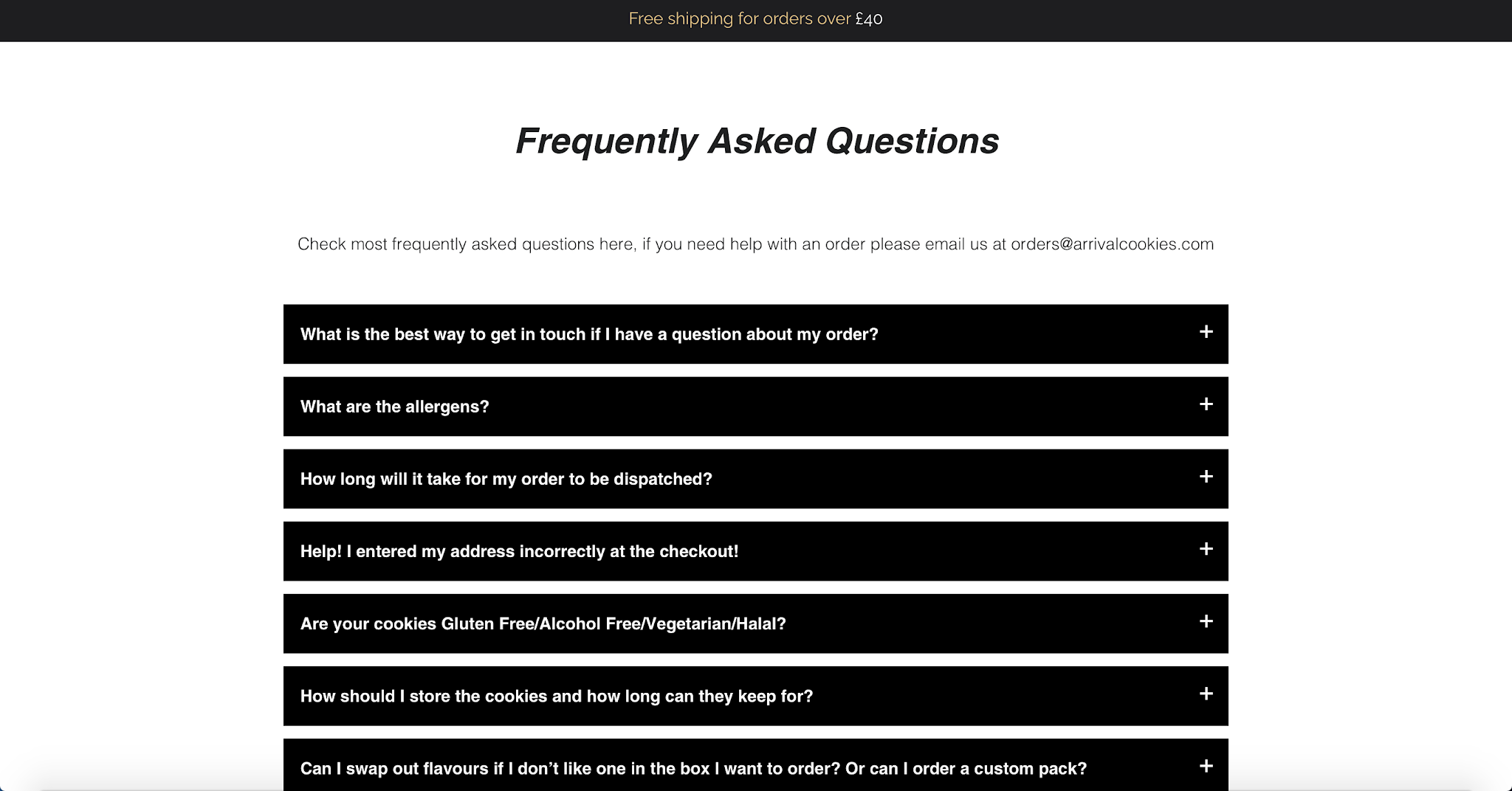
| Product page (Arriva cookies) |
The frequently asked questioned on the arrival cookie website is very neat. Which makes it much more convenient for the user to find the answers to their questions.
Checkout page:
 |
| Checkout page (Arriva cookies) |
Similar to the other website, it is not hard to follow through the process. All needed from the users are to fill in their detail and the way they prefer to checkout with.
Sources: Arrival cookies website
In conclusion, there are main features that almost all website developers should consider including in their websites.
1- Menu to make navigation more convenient.
2-User friendly home page to enhance the user's experience.
3- About us page to make the user feel that they have some sort of attachment to the webpage.
4-Search bar to enhance the user's experience.
5-Sign up page that is straightforward.
6-Product page with all of the essential information about the product.
7-FAQ page that is neat and informative.
8-Contact page with all the information that might help the user.
9-Shopping chart.
10-Reviews section to build up the consumer's trust.
11- Secure checkout page with easy instructions.
Sources:


Comments
Post a Comment