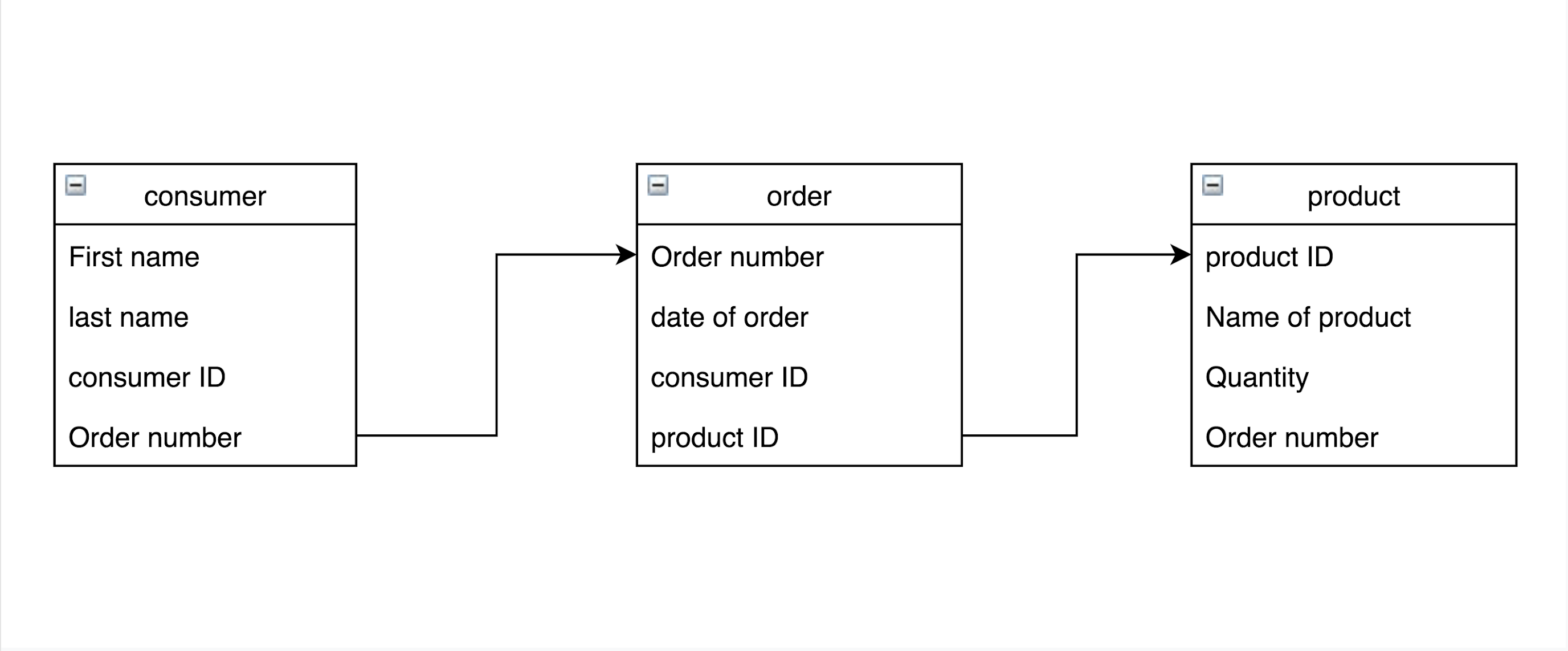
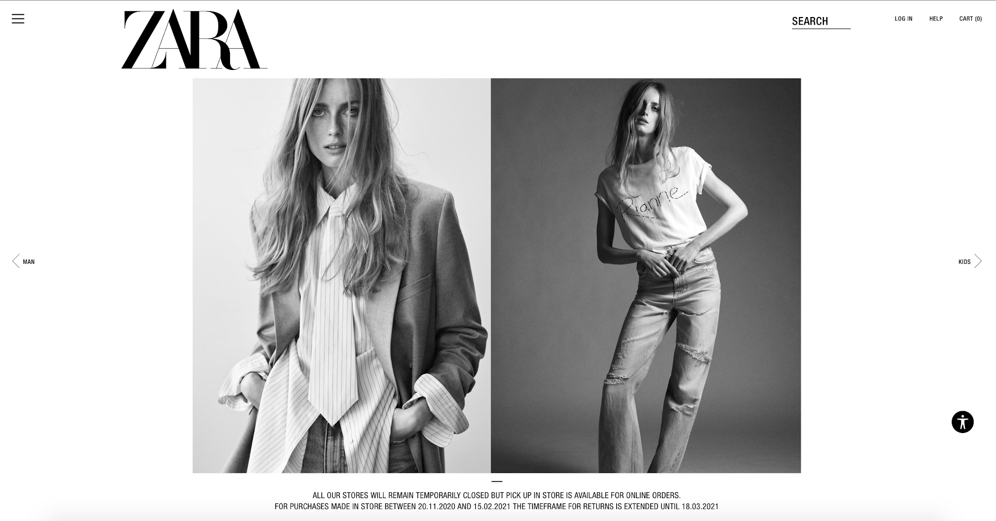
website UX/ Testing activity
Today I had the chance to analyse my classmate Mihaela's website. Overall the website is well structured; it has a header, body, and footer.
The header:
the header includes the important elements. However, the dimensions of the website exceed the webpage. Because, sometimes when the website is published, it appears differently from the editor page. And this problem occurs to me as well.
1-Search bar: The search bar is included. Which is one of the important elements. Yet, it seems that there are some functionality problems as it cannot be used
2-The menu: The menu is included. Furthermore, it has some useful options, such as the size guide.
3-The Logo: The logo represent the theme of Pawsibilities e-commerce.
4- Shopping cart and Log in: the shopping cart is included, but as I mentioned before, it is not visible to the user.
 |
| The header |
 |
| The body and the Live chat |
 |
| Instagram account |
 |
| Facebook account |
 |
| The footer |
Because the menu bar is not connected to the pages, I couldn't view the other webpages. Overall the Pawsibilities website looks professional as all essential features are included. However, the only thing I would recommend is to solve the technical issues and test the website again.


Comments
Post a Comment